css-short-handCSSショートハンドのチートシート
CSSのプロパティにはまとめて記述するための「ショートハンド」という書き方が用意されています。制作のスピードがグッと早くなるので、プロの制作現場ではショートハンドでの記述は必須テクニックです。
fontやbackground、box-shadow、animationなど一括指定を忘れがちなプロパティもわかりやすくまとめているので勉強中や制作中に是非活用してください!
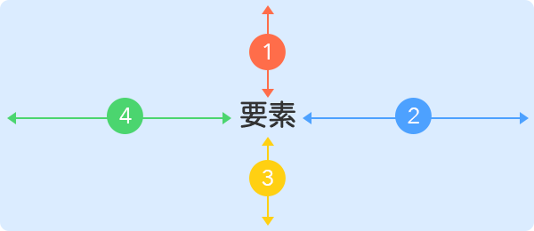
padding / margin
- padding-top : 上の余白
- padding-right : 右の余白
- padding-bottom : 下の余白
- padding-left : 左の余白
point
サンプルのコードのpaddingをmarginに置き換えればmarginも同じ要領でショートハンドを書くことができる。paddingとmarginについての解説 →
Shorthand-1
padding : 上右下左
.el{padding : 10px 15px 20px 30px}Shorthand-2
padding : 上右下左
.el{padding : 10px 15px 20px}Shorthand-3
padding : 上右下左
.el{padding : 10px 15px}Shorthand-4
padding : 上右下左
.el{padding : 10px}border-radius
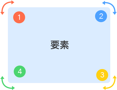
- border-top-left-radius : 左上の角丸
- border-top-right-radius : 右上の角丸
- border-bottom-rightv-radius : 右下の角丸
- border-bottom-left-radius : 左下の
point
ショートハンドでまとめて書く場合のスタートは「左上の角丸」から。左下を省略すると右上と同じ。右下を省略すると左上と同じ。右上を省略すると左上と同じになる。
Shorthand-1
border-radius : 上右下左
.el{border-radius : 10px 15px 20px 30px}Shorthand-2
border-radius : 上右下左
.el{border-radius : 10px 15px 20px}Shorthand-3
border-radius : 上右下左
.el{border-radius : 10px 15px}Shorthand-4
border-radius : 上右下左
.el{border-radius : 10px}box-shadow
Shorthand
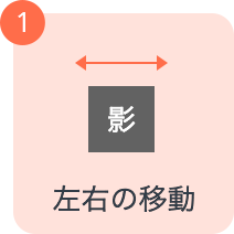
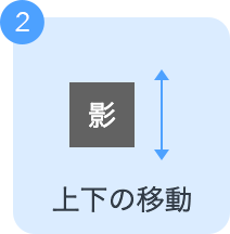
box-shadow : 123456
.el{box-shadow : 2px 4px 10px 4px #000 inset}point
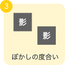
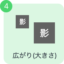
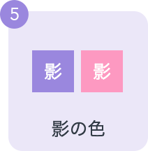
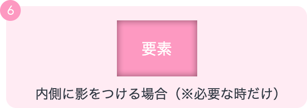
一般的にそれぞれの単位はpxを使う。影の移動には正の整数以外にも「-10px」というマイナス方向の単位の指定も可能。影の色は rgba(0,0,0,0.2)など不透明度を変更した色を指定して調整することが多い。要素の内側に影をつけたい時だけ値の最後に「inset」を追記する。
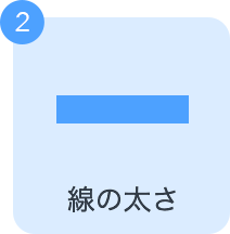
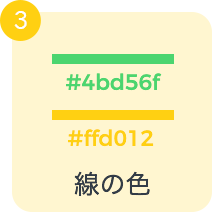
border
- border-style : 線のスタイル
- border-width : 線の太さ
- border-color : 線の色
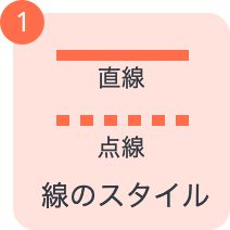
Shorthand
border : 123
.el{border : solid 2px #ddd;}point
書く順番は自由。border-styleは「solid(直線)」「二重線(double)」「dasshed(破線)」など様々な種類がある。border-widthは数値だけでなく「thin(細く)」「medium(普通)」「thick(太く)」などの指定方法もある。
background
- background-color : 背景色
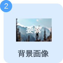
- background-image : 背景画像
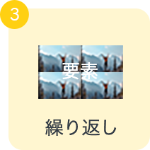
- background-repeat : 背景画像の繰り返し
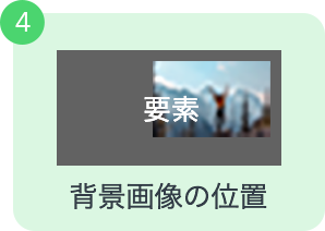
- background-position : 背景画像の位置
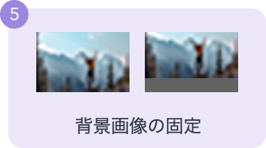
- background-cover : 背景画像の固定
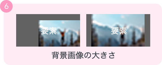
- background-attachment : 背景画像の大きさ
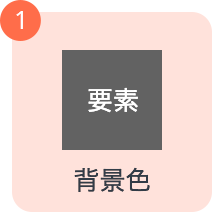
Shorthand
border : 123456
.el{background : #333 url( bg.png ) no-repeat 0% 50% fixed / cover}point
1〜6すべてを書く必要はなく、「background-color」だけ書くのもOK。「background-position」は「左右 上下」の順番で書く。「background-size」を記述する場合は必ず「/(スラッシュ)」で区切ってから値を書く。
font
- font-style : 文字のスタイル
- font-weight : 文字の太さ
- font-size : 文字の大きさ
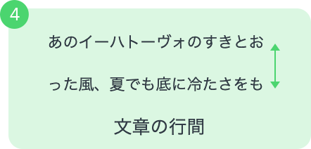
- line-height : 文章の行間
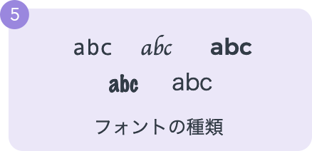
- font-family : フォントの種類
Shorthand
font : 12345
.el{font : italic bold 16px / 1.8 Arial,'MS ゴシック', sans-serif;}point
font-sizeとfont-family以外は省略可能。font-sizeとline-heightを両方書く時は、2つの値の間に「/(スラッシュ)」を入れるのが必須。フォント名が「MS ゴシック」のように半角スペースを含んでいる場合は引用符で囲む必要がある。
list-style
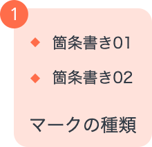
- list-style-type : 箇条書きのマークの種類
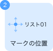
- list-style-position : マークの表示位置
- list-style-image : マークを画像に変える
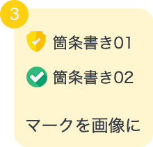
Shorthand
list-style : 123
.el{list-style: square outside url('mark.png')}point
list-style-typeとlist-style-imageを両方指定した場合はimageが優先され、画像が表示できない場合にlist-style-typeのマークが表示される。マークの位置は「inside(リスト要素の内側)」と「outside(リスト要素の外側)」の2つを選択できる。
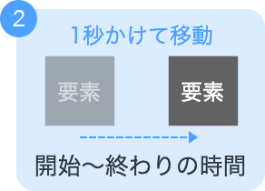
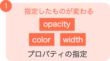
animation
- animation-name : アニメーション名
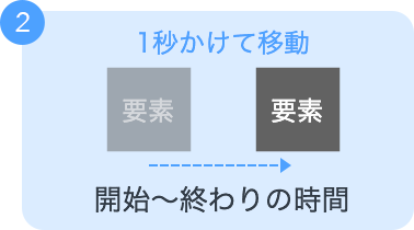
- animation-duration : 開始〜終わりにかける時間
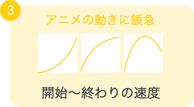
- animation-timing-function : 動きの速度の指定
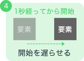
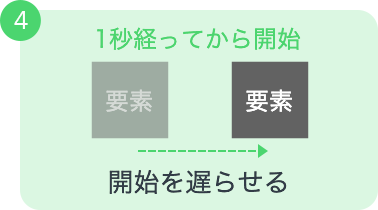
- animation-delay : 開始を遅らせる
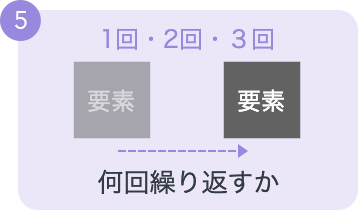
- animation-iteration-count : 繰り返しの指定
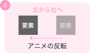
- animation-direction : アニメの再生方向の指定
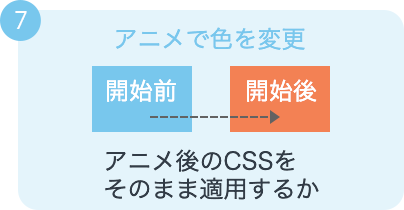
- animation-fill-mode : アニメ終了後のCSS
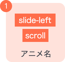
Shorthand
animation : 1234567
.el{animation : slideIn 0.3s linear 1s 0 alternate forwards;}point
1〜7すべてを書く必要はない。
書く順番は厳密には決まりはないが守ったほうが期待通りの動きになるので順番は守るのがオススメ。アニメーション終了後のCSSを維持したい場合に「animation-fill-mode」の値を「forwards」にする。
transition
- transition-property : アニメーションさせたいプロパティ
- transition-duration : 開始〜終わりにかける時間
- transition-timing-function : 動きの速度の指定
- transition-delay : アニメーションの開始を遅らせる
Shorthand
transition : 1234
.el{transition : all 1s ease-in 3s;}point
「transition-property」には変化をアニメーション付きにしたいプロパティを指定する例えば「color」ならその要素の文字色だけがアニメーション変化をする。値を「all」にすると全てのプロパティがアニメーションの対象になるので一般的にはallにすることが多いい場合に値を「forwards」にする。「transition-delay」は「transition-duration」を書いていないと指定できない。
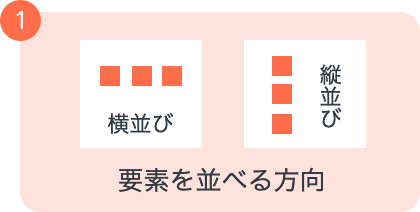
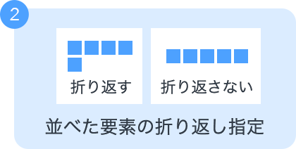
flex-flow(親要素)
- flex-direction : 要素を並べる方向(縦・横)
- flex-wrap : 要素の折り返しを許可するか
Shorthand
flex-flow : 12
.el{flex-flow : row-reverse no-wrap}point
flex-boxの親要素につけるプロパティで順番は任意。で要素を並べた時の「要素を並べる方向」と「要素の折り返し」を一括で指定できる。「flex-direction」は「row」で横並び、「row-reverse」で要素の順番を逆にして横並び。「column」で縦並び、「column-reverse」で要素の順番を逆にして縦並び。
flex(子要素)
- flex-grow : 子要素ごとの大きさの比率
- flex-shrink : 親要素が縮んだ時の子要素ごとの縮む比率
- flex-basis : 子要素ごとの要素のサイズ指定
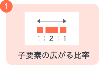
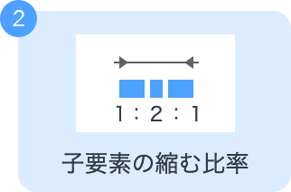
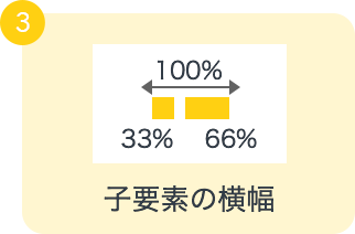
Shorthand
flex : 123
.el{flex : 1 2 30%}point
flex-boxの子要素につけるプロパティ。コンテナ内にある子要素それぞれに伸び縮みの比率や横幅を指定する必要がある。「flex-grow」と「flex-basis」が両方指定してある場合は、flex-growの比率に基づいて広がるが、親要素が縮んだ時にflex-basisで指定した横幅よりは縮まない。